Website Best Practice Guidelines
These are some basic guidelines to keep in mind while updating the LWVCC site. The goal of these guidelines is make sure the branding is consistent across the website and to ensure the site is as usable as possible and meets legal accessibility standards.
Usability is an umbrella term used to describe how easy a website is to use. Accessibility is a more specific term referring to how easy it is for people to access the content of your site. It is most commonly used to refer to how easy it is for people with disabilities (including visual, hearing, cognitive, and mobile impairment) are able to use the site, but can also include things like how easy it is to access the site while on a mobile device or using a poor internet connection. Ensuring a site is accessible for people regardless of their abilities or equipment is both the morally and legally right thing to do.
This guide will cover general guidelines. To see guidelines about the custom elements on the site, visit the Custom Elements Guide.
Color
|
Use consistent brand colors
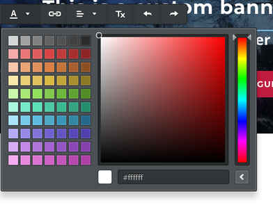
In order to keep the site consistent, use the following color codes for text and background colors Blue - #005596 Red - #be0f34 Purple - #820263 Yellow - #eca400 Dark Blue - #08395C Dark Red - #7F0F29 Dark Purple - #521c50 Dark Yellow - #9C6506 Light Blue - #4D94D2 Light Red - #E56A86 Light Purple - #AC5997 Light Yellow - #F2C373 Using the color codes differs depending on what kind of element you are using. With text, you need to click the "change color" tool in the edit bar, then click the ">" button at the bottom to reveal where you an input the color code. For tools like the color content box it will show you the option to input the color code upfront. |
Do not rely on colors alone for meaning
While colors can be very helpful for aiding understanding, it is important that you do not rely solely on colors for conveying information. For example, if you wanted to draw attention to a bit of text in a paragraph like a deadline, you can make the text red, but you should also make it bold. This is because people with colorblindness may not be able to see the color difference, but they will see the font weight difference.
While colors can be very helpful for aiding understanding, it is important that you do not rely solely on colors for conveying information. For example, if you wanted to draw attention to a bit of text in a paragraph like a deadline, you can make the text red, but you should also make it bold. This is because people with colorblindness may not be able to see the color difference, but they will see the font weight difference.
Text
Text needs to be no less than 12px (and ideally more) and must contrast with the background
Text accessibility comes down to two things: size and color contrast between the text and the background.
The default paragraph text size for the site is 18px. Any time you pull in a text element from the Weebly side bar it will default to 18px. It is strongly recommended you do not alter this, as it will lead to inconsistencies between text size across the site. If you must change the text size, it should not go below 12px.
For the text color, it must have enough contrast with the background, which you can check with a tool like the WebAim: Contrast Checker and input the text color background color. The checker will then tell you if it passes AA or AAA standards. While passing AAA is nice, passing AA is all the you need to be concerned with.
Links
Link text should be descriptive, not generic (no "click here" links!)
While creating links from one way to anther may seem simple, there is a very important aspect of it that most people miss. In order to make sure links are accessible to blind users who use a screen reader (a tool that reads the content of the webpage to them) you need to ensure that the link text itself is descriptive enough that if it were read out of context it would make sense to a user. If it's not, this could cause problems for blind users.
For example, take the following sentence: "For more information about the upcoming election, click here."
While this makes sense to a sighted user, a user with a screen reader who is asking the screen reader to tell them what links are on the page will only hear "Click here" without any indication of where that link will take them! This can get especially problematic when you have multiple links on the page that say the same thing.
A much better version of the above example would be something like "Learn more about the upcoming election." Now, when the linked text is read out loud, the user will know exactly what they should expect to find when they click that link.
Images
Images that contain important information and are not just decorative must have "alt" text.
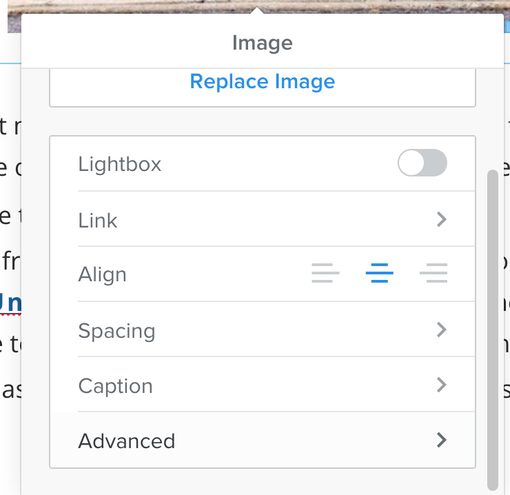
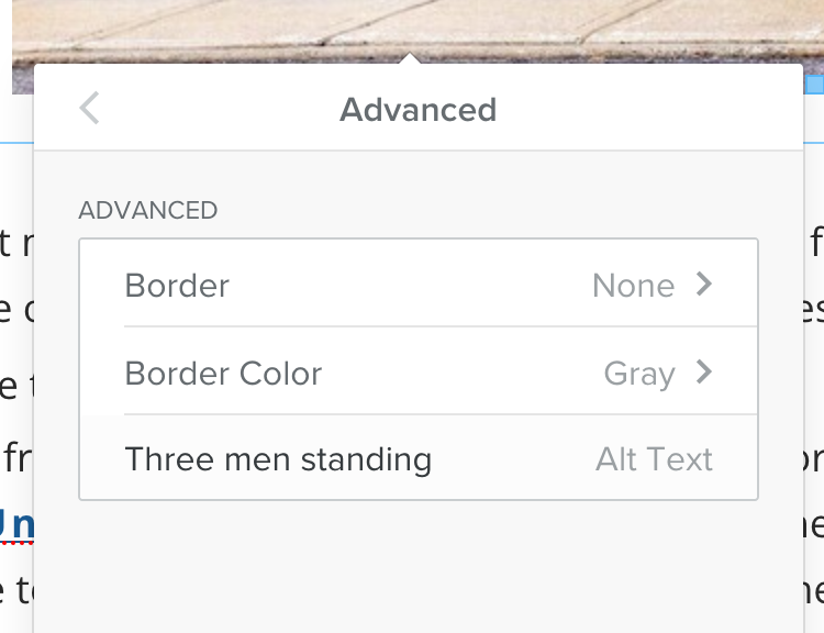
Blind users who use screen readers to "read" a site often have issues with images. By default, the screen reader will just tell the user that there is an image on the page but it will not be able to know any details about the image unless you provide them using "alt" text. To add alt text to an image in Weebly, first add the image into the page, then double click to make the editor appear. You will see an option labeled "advanced" at the bottom of the editor. Click this and you will be taken to a second page where you can enter the alt text.
Blind users who use screen readers to "read" a site often have issues with images. By default, the screen reader will just tell the user that there is an image on the page but it will not be able to know any details about the image unless you provide them using "alt" text. To add alt text to an image in Weebly, first add the image into the page, then double click to make the editor appear. You will see an option labeled "advanced" at the bottom of the editor. Click this and you will be taken to a second page where you can enter the alt text.
When writing alt text, it important to consider what it is important for someone to know about the image. If the image is purely decorative you can put something simple like "A large crowd." If you wish to convey something about the image, you might consider "A large crowd at the Women's March in Champaign."
If the image has text in it, you must add all the text from the image in the alt text, as it cannot be read directly from the image by the screen reader.
If the image has text in it, you must add all the text from the image in the alt text, as it cannot be read directly from the image by the screen reader.
Important Text should not be in images
It is best practice that you do not put important in images without also providing that information in text somewhere on the page. If you do not include the same text somewhere else on the page, you need to put all the text in the alt text, which can get very long. This can also cause problems for people on poor internet connections, as the images may not load. To be safe, use text for information and images for decoration, and if images are required for conveying information (for example, a map or a graph) provide enough alt text to explain the information you expect people to get from the image.
It is best practice that you do not put important in images without also providing that information in text somewhere on the page. If you do not include the same text somewhere else on the page, you need to put all the text in the alt text, which can get very long. This can also cause problems for people on poor internet connections, as the images may not load. To be safe, use text for information and images for decoration, and if images are required for conveying information (for example, a map or a graph) provide enough alt text to explain the information you expect people to get from the image.
Images must be used legally
Just because an image is online doesn't mean it's fair game to use! Make sure who find out the license of the image before putting it on the site, otherwise you are opening yourself up to potential legal issues. Ways to find legal images include:
Just because an image is online doesn't mean it's fair game to use! Make sure who find out the license of the image before putting it on the site, otherwise you are opening yourself up to potential legal issues. Ways to find legal images include:
- Use your own images - Either take the photos or create the graphic yourself
- Find images that are licensed for free use - There are lots of sites out there for helping you find free images, like Creative Commons search, Unsplash, Pexels and more. Be sure to check the details of the terms of use for each image, as some may be free to use but require you give attribution to the creator.
- Purchase Images - You can purchase images to use the site from various sites like iStock and ShutterStock.
Layouts
Keep all text and important elements on the page left aligned
Having all text aligned, rather than jumping back and forth between left aligned and centered, makes the text easier to read and scan. When the paragraph title or text jumps between left-aligned and centered, it causes the users to jump around, and makes it easier for them to lose their place. Additionally, putting titles or important text off to the center or right can cause issues for users with low-vision, who may be zoomed in on the webpage and can miss the center text that is off screen when zoomed in.
Having all text aligned, rather than jumping back and forth between left aligned and centered, makes the text easier to read and scan. When the paragraph title or text jumps between left-aligned and centered, it causes the users to jump around, and makes it easier for them to lose their place. Additionally, putting titles or important text off to the center or right can cause issues for users with low-vision, who may be zoomed in on the webpage and can miss the center text that is off screen when zoomed in.


